Friday, 24 January 2014

Final Designs


Evaluation: Question 7 - Looking back at your preliminary task, what do you feel you have learnt in the progression from it to the full product?

Looking back at both my skills audit and my preliminary task, my skills on a mac and on InDesign have improved. At first I was very unfamiliar with macs and did not know how to use them, but I am now very comfortable using both a mac and InDesign, the development of my skills is evident in the difference between my preliminary task and the final design of my pop music magazine below.


There is a lot more variety in the decoration of my final design. Firstly, the fonts, when making my student magazine I was still very unfamiliar with InDesign and the mac controls so I did not experiment with many different fonts, I have only used 1or 2 different fonts for the preliminary task, making it look dull. When making my music magazine I was a lot more comfortable with the controls and tried lots of different fonts and font sizes, for the final design I used 5 or 6 different fonts, of lots of different sizes this shows how my confidence using the InDesign program grew during the making of it.
Another way my skills have developed is the use of plugs and puffs, when making my student magazine I only used 1 picture, which was for the whole cover, I did not add any others to make it more appealing. I have only used cover lines for my student magazine which will not stand out for an audience. For my final music magazine I have used a variety of plugs, puffs and cover lines to make my magazine stand out for the target audience. I have used puffs such as 'PLUS!' and 'WIN!' to attract an audience. I have used pictures to pull in the audience to make them want to get a better look. I have used plugs that I am sure will appeal to my target audience, I have included the 'Free one direction poster in this issue!' as this band will appeal directly to my target audience as will the plug that offers the chance to win a meet and greet with them. These additions to my magazine show how confident I am with InDesign and the different features of it that could improve my magazines appeal. I have learnt how I could add to my magazine to make it stand out with different colours, fonts, layouts and pictures. I can now use InDesign with ease and am confident with a mac computer. I used my preliminary task during the making of my final magazine design to help me understand what more I can add to make my magazine more appealing.

Evaluation: Question 6 - What have you learnt about technologies from the process of constructing this product?

Evaluation: Question 4/5 - Who would be the audience for your media product? How did you attract/address your audience?

The target audience I had in mind while creating my music magazine 'Volume' was young girls aged 11 - 15. Many girls around this age are big fans of artists such as One Direction and Taylor Swift. I have included these in my plugs and puffs on my magazine cover to make it more appealing to this audience. A lot of my audience will probably consume many other types of media as they have been brought up in a world surrounded by them. These other types of media include: The Internet (Facebook, Twitter, Tumblr), Television (channels like MTV) and other magazines (gossip magazines). As these social media sites are extremely popular with my target audience, my magazine would also have an official website, a facebook page and a twitter page. This enables my audience to access my magazine through other sources.
I have created a survey for my target audience and will gather some information, using it to find out what attracts the audience and how I can use these answers to help with the design of my magazine to make it more appealing to my target audience.


Evaluation: Question 3 - What kind of media institution might distribute your media product and why?

Evaluation: Question 2 - How does your media product represent particular social groups?

Evaluation: Question 1 - In what ways does your product use, develop or challenge forms and conventions of real media products?


My music magazine uses the forms and conventions of other pop music magazines in many ways. Above I have put a screen print of my music magazine next to We Love Pop magazine.
I have used a bright colour scheme, blues and pinks, like the other magazines orange and blue colour scheme. I have put the fashion article in the bottom left corner like We Love Pop. I have used popular artists names on the cover to appeal to my target audience. These plugs and puffs use and develop the forms and conventions of other pop magazines as they appeal to the magazines target audience and are used in similar ways.


Monday, 20 January 2014

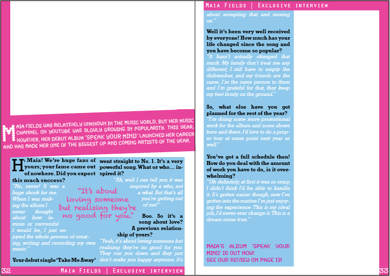
Double Page Spread: Drafts


This is my first draft of my double page spread, I have written the interview into the columns. I have added coloured backgrounds to the text and put in a pull quote. I have added the page numbers in.
I will add a masthead at the top of the page with another quote from the interview underneath. I will then add in the pictures I have taken for the double page spread.


I have now added a masthead and a quote underneath it.

Monday, 6 January 2014

Flat Plans


This is the flat plan for the front cover of my music magazine.


This is the flat plan for the double page spread of my music magazine.

Monday, 16 December 2013

Contents Page: Second Draft


Contents Page: First Draft

I have now started on the contents page. I have placed a screen grab of the front cover on this page with the featured articles and page numbers underneath. I have also used another picture of the cover person on this page with more information about the interview.

Thursday, 12 December 2013

Fifth draft

This is my fifth draft, I have reorganised the cover lines and added a new one, as well as a new competition and the bottom of the magazine, this will appeal to the target audience as One Direction are a hugely popular band among the audience. I have also added another of one of my own pictures to the Taylor Swift cover line.

Monday, 9 December 2013

Fourth Draft

This is my fourth draft, I have added another cover line and removed some things. I have also added some more of my own pictures in the bottom left corner, these are christmas/winter themed and I have changed the season of the magazine to winter. I am going to add photo to the cover under the Taylor Swift cover line and I will add more information about the cover person.

Thursday, 5 December 2013

Third Draft


I have now added a cover photo and rearranged the format. I have also changed the style of the cover lines and added a new one. I have also added one of my own pictures to a plug in the top right corner.


Monday, 2 December 2013

Second Draft

This is the second draft of my music magazine, I have added some more cover lines and plugs/puffs. I will add the cover image before I add anything else. This is the autumn issue so I have used pinks and blues on the cover. Jessie J is a popular artist so this will entice younger readers, as will the offer of a free one direction poster.

Thursday, 28 November 2013

Early drafts: Music Magazine

First Draft
This is my first draft, I have changed the masthead that I originally made. I decided not to use the original masthead as I didn't think it would appeal to the target audience of my pop music magazine. The font has been changed to one more suitable to the genre of music. I will change the colours and maybe the layout.


Second Draft
This is my second draft, I changed the colours to make them more suitable. I have added a shape at the bottom that I will put a plug/puff in.


Monday, 25 November 2013

Main Task: Music Magazine, Proposal


Popular Music Magazine Proposal

My magazine will be aimed at young girls aged 11 - 15. The image on the front cover will be a head and shoulder shot of a cheerful girl, this will follow the conventions of pop music magazines as they usually have a pop artist on the front cover with a photo of their head and shoulders, they always look cheerful and happy. I will take a photo of one of my friends with a light coloured background with no pattern. It will be a popular music magazine. The typical content will be about popular artists in the pop industry, with fashion articles, competitions and interviews. Some cover lines I may use are: "Win £100 of make up!" "Jessie J solves your problems!" "Guitar tabs of your favourite pop songs!" "Posters of your favourite boy bands!" "Song lyrics decoded!" The title I have decided to use is 'Volume' and underneath I will put the tagline 'Turn it up!' I have decided to use this title as it is music themed and a lot of the time music is better when played loud. The fonts I will use will be simple but eye-catching.
This is a first draft idea of my masthead, I will probably change the colours and alter some of it before I finish the final copy. The magazine will be published once a month and the covers style and colours will be based on the current season/month. In summer the colours will be bright and summery, like greens, blues and yellows. In autumn the colours will be darker, blues, reds, oranges. The magazine will be A4 sized. On the contents page I will put another picture of the person the main article is about and will put a short interesting part of the interview over the photo, the colours will be similar to the front page. I will also put smaller pictures I have taken of other bands/artists that are featured on the front cover. My magazine will be prized at £2.00. This price is suitable for all classes (working class, middle class etc.).  

Monday, 18 November 2013

Photography In Magazines


The Rule of Thirds


This rule is based on the theory that the human eye is naturally drawn to a point about two thirds up a page. A photo may be more pleasing to the eye if the object, or focal points, are located around one of the intersecting points.


Lines that can be found in images are powerful elements, with a little practice they can add dynamic impact to a photograph in terms of mood as well as leading a images viewer into a photo. 
Diagonal lines create points of interest as they intersect with other lines and often give images depth by suggesting perspective.


The uses of photography in these two magazine covers are very different. 
Vanity Fair has used the rule of thirds while laying out this front cover. Lady Gaga is on the right side of the magazine, leaving the left side for the articles featured in the magazine though some articles have been printed over her as well. Her head is just above two thirds up the page. She is looking slightly down at the camera meaning it has been taken from a slightly low angle. Her demeanour is relatively calm looking at her facial expression and the way she is sitting. 

The Source magazine cover is completely different. 
The rule of thirds has been ignored and the cover person is directly in the centre of the magazine with articles featured either side. The nature of this front cover is a lot more frantic than Vanity Fair. The man on the cover's facial expression comes across as scared or worried. His face in the middle of the intersection making it the focal point. The photo has been taken from the same eye line as the person on the cover and is a close up showing his emotion.

The Conventions of Pop Music Magazines